Whether robots, animatronics or purely onscreen avatars, how your creation looks and moves will make or break an emotional connection with your audience. Will they regard it as believable and “alive,” or a dull and obvious assemblage of mechanisms and software?

As technology-minded people, we have a strong inclination to break problems down into purely technical solutions…quantifiable things like servo torque or RAM usage…but life, and the simulation thereof, is as much (perhaps more so) dependent on informed aesthetic judgments. It’s a matter of applying both science and art. Either medium can produce impressive and interesting things; it’s when they’re working together that the effect becomes sublime.

Programmers sometimes use the term “wetware” (with varying degrees of seriousness) to describe those parts of a system that are neither hardware nor software, but rely on the human brain. Good design can wring the most from all three.

In my experience having worked many positions over the years, I’m impressed how a diverse range of very technical fields (for example, user interface design) all benefit from tapping into our psychology and emotions, much as art and theatre do. What’s more, I marvel at just how closely the human mind sits continually on the brink of suspension of disbelief. The slightest bump will pull people into fantasy. It’s something I call the “lion dancer effect”…

Lion dance during Chinese New Year 2015 by Myrabella (Own work) [CC BY-SA 4.0], via Wikimedia Commons

Perhaps you’ve seen lion dancers perform, especially around Chinese New Year. The costumes do little to conceal the human performers inside…in fact, they’ll often lift the lion’s head high above their own, placing themselves in plain sight. And yet…a moment later, with the head pulled back down, almost instantly you perceive the lion again as its own living character. They haven’t just mastered a dance, they’ve mastered invisibility. Your mind is eagerly tricked by a convincing performance. This isn’t just about dance…it’s true of every field of endeavor.

You can learn that craft, and you can instill it in your creations.

Alongside studying circuits and code, consider rounding out your knowledge with dips into biology, psychology, art, film, theatre and stage magic. Not only will your creations better connect with people, but you can watch Pixar films and the Muppets and call it “research.”

Movement is so important, I put it first. The lion dancer demonstrated: even a simple design becomes “real” through convincing movement. The opposite is seldom true; good looks won’t save a lousy performance. Motion is emotion.

Few will admit to liking mimes, but face it: they are masters of physical storytelling. The Swiss Mummenschanz troupe can set up a joke without uttering a word…then deliver the punchline with not an actor or prop on stage. Like assembly language is to programming, theirs is absolute minimalism of theatre…watch how they’re able to convey emotion from the most unexpected places. Your mind completes their act.

Magicians often use misdirection — diverting your focus of attention — to achieve seemingly impossible feats. How might you apply this in, say, a robot? Maybe there’s some unavoidable weakness in one area of motion…some mechanical-ness that gives the trick away.…could a flourish of action elsewhere distract your audience and cover for this?

And animation, of course, is king of visual storytelling…

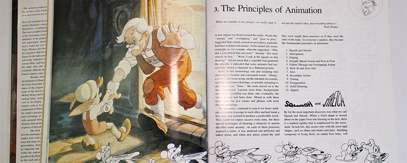
Countless books have been written on the subject, but the seminal tome is Disney Animation: the Illusion of Life by Ollie Johnston and Frank Thomas, chronicling their work among Disney’s “Nine Old Men” throughout the medium’s formative years.

Chapter three in particular warrants our attention…not about history or technique, it describes the animators’ core principles, codifying the visual “language” that defines western animation to this day.

These principles are still entirely relevant in our computer-generated age…John Lasseter of Pixar authored a SIGGRAPH paper following them point-for-point…and many of these ideas translate beyond the screen…it’s just good theatrical advice. If you can’t justify buying the entire massive book, this most vital chapter has been distilled into many articles and videos online, even Wikipedia has an entry: Twelve Basic Principles of Animation. The full text of chapter three (including animated specimens) is available in the Disney Animated app for iPad.

Occasionally, the right action is inaction. Too much motion can be just as damning as too little. Watch squirrels run around eating acorns in the park…notice how they periodically “lock up” to focus on some sound or action. Small, inconsequential motions can add believability too. 1933 audiences insisted the T. rex in King Kong was real because it scratched itself…a special effect wouldn’t do that, it was thought.

Your eyes deceive you. Nothing is what it seems. People are not stick figures. Eyes are not football shapes. Cat ears are not triangles.

Homework assignment: go on Amazon and buy the oldest, most dog-eared early edition you can find of Betty Edwards’ book Drawing on the Right Side of the Brain. Reason for getting an old copy is that each successive edition got a little longer and strayed a little further from Edwards’ central idea: that we see the world through a perceptual filter, one that turns things into symbols and words…and when we try to turn those symbols back into images, it usually ends in heartbreak.

The artist’s “gift” — the thing that makes them seem superhuman — we confuse it for technique, how one holds a pencil or works their brush strokes. But it’s a gift really of observation, that they’ve developed the knack to switch off or to tweak the parameters of that perceptual filter. This book is as much about psychology as art.

Even if you have no plans to draw another thing in your life, follow along with the exercises in this book…it’s startling, an eye-opener…and it’s entirely relevant, even if you’re making something like robots, if your aim is appealing, engaging robots. To accurately mimic a thing, or a part of a thing, you must objectively see its true shape first.

Another book recommendation…last one, I promise…is Cyclopedia Anatomicae by Gyorgy Fehér and András Szunyoghy. There exist tons of anatomy books, but pound for pound this one’s tough to beat as a one-stop reference. It’s an enormous volume, half devoted to the human figure, half to other animals.

Regardless whether you’re aiming for “realistic” or even “human,” understanding the shape and structure of things is vital. Exaggeration (caricature) requires first grasping the basic form.

Living things are complex and subtle. Each finger is a different character, with its own direction and length and girth. Ostriches don’t have knees that “bend backwards” — that’s their ankle. Getting a handle on anatomy…and comparative anatomy…is another essential skill in this quest.

Some odds and ends…

Pixels

When possible, avoid treating pixels as the smallest discrete unit. Stepping pixel-by-pixel, off-or-on has a dated, 8-bit look to it…careful programming can create the feeling of a continuous analog space.

Consider K.I.T.T. from the Knight Rider TV series. His distinctive front scanner had only a few pixels, but a well-designed fading effect gives it a “living” aesthetic; this is no cold machine. (Nor is it all blinking lights…the sporty exterior, the charming voice, everything worked together to make an appealing character of an improbable setting.)

The logical extreme may be the single-pixel “sleep” light on some Apple products, which creates the impression of breathing. One pixel!

Shown here are Adafruit’s iCufflinks, which mimic the effect.

The Arduino code for our Gemma Firewalker Lite Sneakers project has a heap of comments about coordinate spaces and math and this idea of avoiding whole-pixel transitions.

Counterpoint: sometimes you may want to embrace the pixelated effect! Nostalgia is one reason…to mimic some system of the past. Or you may want to make a device that’s actually quite sophisticated appear simple and cute.

Shown: Animated Flying Toaster Jewelry reminiscent of the 1980s After Dark screensaver.

Life is Not a Powerpoint Slideshow

Avoid cycling mode-to-mode. Our brains pick up very quickly on repeating patterns. Perhaps more than anything else, just running down a bullet list of features in sequence stops the illusion of life in its tracks…it’s like a boring meeting, but without the donuts.

Welcome to Powerpoint by Gareth Saunders [CC BY-SA 2.0], via Wikimedia Commons

Mode-cycling is fine when you’re demonstrating technical elements to other technical users. When interacting with the layperson, keep it “alive,” and keep a few of your best tricks in reserve for special moments!

Mix it up. Make judicious use of random numbers, whether for positions or time intervals. Similar to the “repeating pattern” issue above, we quickly recognize something as non-living and mechanical when everything’s equal-time or if motions always follow an exact set path.

The Arduino random() function can optionally accept a minimum and maximum range for values returned. If simulating something real…a walk, a movement of the eye…do a little searching to find reasonable averages and ranges. There’s an amazing amount of reference material online…research papers and similar…free for the taking, you just have to look.

If you simply must cycle some things on regular intervals: try using different prime numbers for each…for example, periods of 3, 5 and 7 seconds. Non-primes…especially even values…will generate more obvious “beat frequencies” as they overlap.

Watch out for “self-congratulatory” effects. You worked really hard on something, getting some shape or path just right, perhaps an eye blink…it’s so tempting then to have it unfold slowly, so no moment of your ingenuity is missed. But this destroys the believability of the thing you’ve been crafting. To win over your audience, life has to take precedence over ingenuity. (In Windows XP, on first boot following a daylight saving time switchover, a dialog box would appear telling you the clock changed. This wasn’t actually for your benefit…it was the programmer(s) celebrating their own cleverness in handling the time change. But same idea.)

The Uncanny Valley

Psychologists and roboticists sometimes speak of the “Uncanny Valley”…not a place you can visit, but a phenomenon.

In general, the more closely something resembles a real person, the more familiar it is and the quicker and stronger our emotional response. But a weird thing happens when something’s almost, but not quite human. In this narrow gap — the Uncanny Valley — one’s emotional response is the complete opposite; it’s a major turn-off, triggering something in our brain that fears corpses and zombies. Going either way from there…more human or less…improves the situation.

Mori Uncanney Valley by Smurrayinchester [GFDL or CC-BY-SA-3.0], via Wikimedia Commons

Sometimes you need to intentionally dial back the realism. Being more obviously fake can sometimes make a better emotional connection with your audience.

Other times, you might knowingly set up your tent in the Uncanny Valley and just tough it out. Even getting there means you’re making headway…maybe the next one will be better. Push through!

Yeah, the Electronic Animated Eyes using Teensy project is borderline Uncanny Valley material!

Do More With Less

You may need to ask yourself sometimes if you’re doing things for the right reason.

Exploring new technology is a rush and a learning experience. That’s cool, embrace it. But when it becomes a space race…a popularity contest, or aiming for “the first to do X”…not only is this shallow, but it can be discouraged on purely technical grounds: piling on more tech creates more complexity and more potential points of failure. Most importantly…it may not even be improving the character you’re trying to create. A gimmick. Ask: is this really helping me?

I can think of a fantastic parallel in cosplay fandom — those folks at conventions who dress up as favorite fictional characters. You’ll encounter moments of amazing workmanship and expense. But quite often, the best, the most memorable and “real” characters are often simply-crafted budget affairs. No gimmicks or props, no technological wonders. Their ability to entertain stems from their full portrayal of the character…not just the look, but the walk, the talk…the quotes and the ad-libs.

Robert Franzese pretty much broke the whole internet with his portrayal of Peter Griffin from Family Guy.

I adore working with technology. But when you use technology just for technology’s sake, what you end up with is Jar Jar Binks. Before approaching a character problem with a technical solution, ask yourself:

What would lion dancers do?

This guide was first published on Feb 06, 2016. It was last updated on Feb 06, 2016.